Showing posts with label pastel. Show all posts

Monday, August 29, 2022

Getting Sketchy Again

 I've been really, really lax about my sketching practice for a while now, I've decided to get back into it and in a bigger way.

My primary sketching medium before was mostly line and wash or just pen, before then just graphite.  I've decided I'd like to move in a somewhat different direction yet still keep it simple.  I want my sketches to be more free, more loose, more suggestive and I figured charcoal is the place to start with that.  But what about color? That's usually where things get complicated and where it's easy to create a chaotic, disharmonious mess so again, I wanted to keep things simple.

pastel charcoal watercolor pencil paint

My goal with this is also to come up with a simple, yet functional kit for plein air (outdoors on location) sketching.  While the photo shows my full watercolor palette I decided to try using only three colors to keep things also and maintain color harmony.  I used yellow ochre, burnt sienna, and paynes gray and just one brush, a large round. I used only one charcoal pencil and one piece of compressed charcoal. I also picked out a selection of lighter pastel pencils and hard pastels.  I knew I wouldn't use all of those colors but I wanted a selection to chose from. 
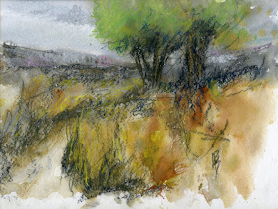
landscape sketch art nature
Studio Sketchbook 1 Sketch 1

I used a 9x12 Strathmore cold press watercolor sketchbook for my first.  The rough texture was a bit much, I'll probably use hot press or multimedia paper next time. I laid down all of the charcoal defining the entire composition making sure to work quickly and loosely.  Then I watered down the entire paper and applied loose and heavy washes of color.  After the paint had dried I went into it with the pastels to add brighter color and lighter areas but being mindful to not get too carried away and keep the colors harmonious.  The composition is straight from my imagination.
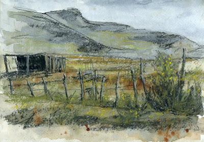
landscape rural art sketch
Studio Sketchbook 1 Sketch 2

I used the same process for this scene based on a photograph I took on the outside edges of the small rural Utah town of Fountain Green in Sanpete County.  This sketch will most likely soon will be used as a reference to make a painting.  Besides the good drawing practice that's another good use for a sketchbook, to test composition ideas for painting.

Now I need to start a plein air sketchbook and I'm also considering making a painting sketchbook, in which I'll actually paint with acrylics in the sketchbook, something I've never done before but after watching some YouTube videos I can see the value of doing that. Stay tuned!

Wednesday, June 17, 2020

First Plein Air Painting of the Year

The weather here has been quite variable this June.  We had high temps drop all the way down into the 50's for a couple days accompanied by crazy wind and thunderstorms so dark it felt like late evening.  Then it got warm for a few days., then if got real cool again. This week has been on the cool side but not uncomfortably so and most importantly it's been at least partly sunny.

I took advantage of the finer weather to get out and paint outdoors (plein air) for the first time this season.  I've sketched outdoors a few times but this is the first time I took the whole painting set up out. I decided to take out the pastels because acrylics can be difficult in our dry climate but I might give the acrylics a try later this week.

landscape painting pastel nature art

I set up at a trailhead on the Jordan River Parkway near where I live in Taylorsville, Utah.  The parkway runs through the whole valley and is full of scenes ripe for the "canvas".  I took a couple short live videos on my Facebook page.


Sunday, July 7, 2019

No Prints, No More

It's been more than a year since my last blog post.  I had stopped blogging for two reasons.  One, I couldn't tell that me or anybody else was really benefitting from it, and two I got distracted by other things, namely social media and photo based art.  I have now decided to repent, at least to some extent.

The big news is I've closed my Fine Art America/Pixels (FAA) account.  I was using FAA as my website and my print-on-demand service.  I've now redirected my domain back to this blog and for the foreseeable future will not offer my art print-on-demand. I won't go into detail the reasons why but suffice it to say I don't feel FAA serves my needs anymore and I also feel it was a distraction from pursuits that for me are probably of more value. I would like to thank those few that did purchase prints of my art on FAA.

My original paintings and drawings are still available.  You can either contact me via email or shop on ebay where I have many pieces listed.

Since I've closed my FAA account I can turn some of my focus back to this blog. I actually plan to start blogging again though I can't say for sure how regular I'll be about it, I'll shoot for once/week but won't make any promises.  I'll also gradually work on cleaning stuff up here.  The portfolio pages are out of date and I think many links are dead, please be patient, this is going to take some time.

I suppose since this is an art blog I should post some art.  This is the latest artsy thing I've done, just a quick charcoal and pastel sketch based on a photo I took on a recent visit to the Erickson Ranch in Wallsburg, Utah.

sketch drawing charcoal paste truck abandoned rust rusty

Wednesday, May 9, 2018

Keeping it Subtle

art drawing charcoal truck abandoned rust rural farm
Click on image to enlarge

"Bygones"

$160
12" X 16", Charcoal and soft pastel on paper

While I do enjoy drawing with charcoal I kind of miss color while doing so.  If you look at my paintings you'll notice I tend to get pretty colorful with them much of the time.  I've added color to charcoal paintings in the last by first applying a watercolor wash and adding a few pastel pencil marks at the end.  I decided to try something a little different this time.  I did start out intending to do just a straight up charcoal drawing but as I went along I couldn't help imagine it with some color.  First I just applied some ochre tinted charcoal to the foreground but that wasn't enough.  So I got out my pastel painting travel box and picked out a few pastels with grayish tones that fit the theme of the drawing.  I was concerned that the Arches hot pressed watercolor paper I was using wouldn't have enough tooth to hold the pastel so I made sure to keep a light touch.  I was pleasantly surprised to see the paper take the pastel quite well, though only light layering is possible.  Just the fact that the pastel was being mixed with charcoal kept the colors on the gray side but I made sure to use colors that would not overpower the drawing.  Bright, saturated colors alongside charcoal just wouldn't look right, at least not with this subject.  I'm pretty happy with how this worked out, I'm sure I'll mix pastel and charcoal more often in the future.

As for the subject, it's an early 1970's Ford heavy truck.  I'm not sure exactly which year or model but it had a gross weight rating sticker on it for 21,000 lbs. so it was pretty heavy duty.  I found it sitting in a field on a ranch or farm in Leamington, Utah.  Leamington is a very small town in west central Utah yet I enjoyed exploring it very much, it had a few abandoned tractors, trucks and cars as well as just having the general appeal of a rural town out in the middle of nowhere surrounded by open space.  I saw very little movement while I was out there and heard even less, the kind of place I think I'd like to retire to.  As for the title, "Bygones" I'm honestly not sure where it came from or how it applies to this drawing.  Sometimes the title for a piece comes to me before I even start working on it, however more often than not I don't come up with a title until I'm finished and need to post it online, that's what happened to me with this one.  While I was uploading the file the title just kind of popped into my head, I'm not sure what it means but for some reason it seems perfect.


Sunday, December 18, 2016

To Cold Outside, How About Car Sketching?

It's important as representational artists that we make sure to spend some time working from life.  I'll admit I've been rather slack about that this year so I decided to remedy that a bit today.  While today was sunny it was also very, very cold, 23*F when I went out today.  I'll admit, I'm quite the wimp when it comes to the cold so my solution today was to sketch from inside the car.  Even with the engine off it was bearable, (no doubt thanks to the sun beaming through the windows) though the windows fogged up after a while.  Not breathing was not an option so I had to work quickly, besides it was late afternoon and the light was changing fast and would be gone altogether soon.

art sketch plein air car charcoal drawing pastel

A steering wheel makes a passable easel, though movement is somewhat limited inside a car and that does effect the sketch because it's pretty much impossible to make marks from your shoulder, at best marks were made from the elbow but even that wasn't easy.  Having to sketch from inside the car also limits the subjects available but this wasn't about making a polished piece of art, it was about practice from life, any subject would do as long as it had interesting and challenging shapes.  Obviously I'm more used to sketching classic cars.

art sketch plein air house charcoal tree pastel

Here's the finished sketch, if you can call any sketch finished.  I used charcoal then added some touches of color using pastel.   I'd rather not sketch from inside a car, but in a pinch it will do.


Thursday, September 1, 2016

More Things With Wheels

I went back to playing with the pastels again, I decided to try a vehicle painting.

art painting truck abandoned ford flatbed rusty

"Glory Passed"

Pastel on paper 9" X 12"

The truck is a 1946 Ford flatbed abandoned on desert ranch.  It's kind of sad to think of the current state of this old workhorse.  Just think of all the useful work it did for some farmer or rancher back in it's glory days.

I also recently did this mixed media sketch of an abandoned car;

art sketch charcoal car abandoned mercury tudor sedan

"Has Potential"

Mixed media on paper, 5.25" X 10.5"

This poor 1939 Mercury tudor sedan certainly has seen better days, but what a project it would make for a restoration or a cool custom car.  The sketch started with watercolor washes for some subtle underlying color.  Once the washes were dry everything was sketched out in charcoal and then some colorful touches were added with pastel pencils.


Saturday, August 6, 2016

Daily Painting Challenge - Pastel Landscapes No 5

For painting number 5 in my daily painting challenge series I decided to paint a familiar seen, one I see every day.

art painting landscape pastel nature tree field summer

"Good Morning Summer"

8" X 10",  Pastel on sanded paper

This is what I see on summer mornings when I look out my kitchen window.  The morning sun lights up the grasses and the tree trunks.  I don't really feel like I fully captured the effect but that's what keeps us artists going, always chasing the effects of light and trying to put them into our paintings. The developers took the field to the north of me, hopefully this beautiful field that borders my backyard will be around much, much longer.


Friday, August 5, 2016

Daily Painting Challenge - Pastel Landscapes No. 4

It's day 4 of the daily painting challenge and I'm still hanging in there but I will admit I'm struggling to keep the steam up.  Maybe that's why I painted one even smaller than the last.

art painting landscape pastel cottonwood tree autumn fall foliage

"Lone Cottonwood"

7" X 5", Pastel on paper

I did something a little different for this one.  Rather than start with a photo reference I painted from a mini painting I did in acrylic some time ago, it's only 2" X 3 1/2", and it was painted using a 12" X 16" painting I did a year and a half ago as reference.  So this painting is three generations removed from the original reference photo and it still works.   This tree is a cottonwood that stands all by itself in a conservation area in the Heber Valley which is on the east side of the Wasatch mountains directly across from the Salt Lake Valley.  This reminds me of how thankful I am for the movement to restore and/or conserve areas of public land in a natural state.

Thursday, August 4, 2016

Daily Painting Challenge - Pastel Landscape No 3

Here we are at day three of the daily painting challenge.  I'm keeping this post simple, here's the painting;

art painting landscape pastel rural farm ranch countryside

"Across the Acres"

6" X 8", pastel on mounted paper

This scene is based on a photo I took somewhere in the central Utah county of Sanpete.  That area of the state is more open than most of the rest allowing for broad vistas like this one of some storm clouds intersecting the peak of a small mountain in the distance across the acres of hay fields.


Wednesday, August 3, 2016

Daily Painting Challenge - Pastel Landscapes No.2

Day two of my daily painting challenge has come and gone and below is the result.  I decided to make a bit of a demo out of this so further below you'll see some photos of some intermediate steps of my painting process on this particular piece.

I have many photos I've taken on my hikes in the Wasatch Mountains, within minutes I can be out of the crowded, noisy suburbs and in a wild nature wonderland.  The thing that appealed to me most about this scene is the cool, dark shapes created by the foreground shadows and the background trees contrasted by the sunlit grassy area.

art painting landscape pastel mountain wasatch hiking trail

"Day Hike"

9" x 12", pastel on sanded paper

I have a bunch of sheets of 9" X 12" Colorfix sanded paper that comes in all kinds of different colors and I've decided to try using them up for this daily challenge series.  The painting from day one used a dark gray-violet tone.  Because I wanted to emphasize the coolness of the shadows in this painting I decided to use dark blue paper for this painting.  I lightly sketched the composition using a light gray hard pastel.

art painting wip first stage pastel

Next was a loose block-in using a couple layers and a light touch.  I often use a lot of violets for my block-ins, I'm not sure why but they seem to work.  In this case I used some greens and oranges as well.

art painting wip pastel block-in

This stage is basically more refinement of the block-in, gradually introducing more of the final colors.  I'm careful not to get too crazy with using too many different colors though.  I think I used less than 20 colors in this painting.  As you can see the dark and light shapes are better defined.  This is the stage where I want to be sure the composition is what I want before I get too detailed.  I'll spend some time evaluating the painting from a distance before moving on to the final refinements you see in the finished painting at the top.

art painting wip middle stage pastel


Tuesday, August 2, 2016

Daily Painting Challenge - Pastel Landscapes No. 1

I'll admit it, I've been in a bit of a slump lately.  It's not that I haven't made any art, it's that my heart hasn't been fully into it and so I've been kicking around from one project to another not really finishing anything, at least not to my satisfaction.  I decided it's time I gave myself a good, swift kick in the butt, it's time for a challenge.

It's been some time since I last painted with pastels.  Pastels were my first painting medium but I've largely abandoned them lately.  I enjoy painting with acrylics but I figure a change of medium might help me get out of my slump so I got the pastels out.  To really kick it in gear I decided to challenge myself to not only paint with pastels but to also finish one small pastel landscape painting every day for at least a week.   Hopefully this will create the jump start that I need.

Just like much of the country northern Utah is experiencing a bit of a heat wave, though if memory serves me 100 dg+ weather used to not be all that uncommon in July and August but by the way they are making a big deal of it the stats must say different.  Anyway, it's way too hot to be painting outdoors in the late afternoon, or evening and that's the only time I have available during the week so I have to settle for using photo references and work in my comfortable, air conditioned studio, boo hoo.

To cool myself down, at least mentally I picked an autumn scene and to help keep it simple I chose a nature scene.  I encountered this quiet, shady spot while taking a walk on the Jordan River Parkway in the Jordan Narrows section.  I enjoyed taking in all the various colors and textures of the foliage, trees, grasses and bushes while I rested a bit, of course I enhanced those things a bit in the painting;

art daily painting landscape autumn pastel foliage fall

"Quiet Moment"

9" X 12", pastel on paper

I really enjoyed getting dusty with the pastels again, this should be a fun week.


Saturday, July 11, 2015

Torn Between Two Loves

Today and yesterday have been kind of weird days.  I said in the last post I need to get back to a couple unfinished acrylic paintings, well I haven't, at least not yet.  Instead I've been feeling very conflicted about working in pastel vs working in acrylic.  I even went so far as to start an experiment last night.  I started two paintings of the same subject in the same size, one in acrylic and one in pastel.  I'd spend some time working in pastel, take a break then spend some time working in acrylic.  I did this a couple times last night and then again today.  Acrylic was winning, for some reason the pastel painting was fighting me.  It wasn't until today in the afternoon when is occurred to me it might be because I switched surfaces.  I painted "Red International" on Uart 400 which is a sanded paper I had mounted to acid free foam board.  For this experimental painting I switched to Ampersand Pastelbord.  I was so sure that I would like Pastelbord it didn't even occur to me that I might not, turns out I don't and am very surprised.  For some reason the pastel just was not coming off as easily with the Pastelbord, it felt scratchy rather than smooth.  The tooth was easier to fill in to get a smooth look, but the application wasn't smooth, it's hard to describe, I just didn't enjoy using it.  I'm sure it's the perfect surface for some people but not for me.  So now I'll have to restart the pastel side of my experiment using Uart paper this time. 

In the mean time I decided I need to take the pastels outside so I went to Olympus Hills Park in the city of Holladay, Utah.

art painting pastel landscape nature tree plein air

"Silver Trees by the Path"

5" X 7", Pastel on paper mounted to foam board
Original - $50


art painting pastel landscape plein air nature tree grass

"Young Tree"

10" X 8", Pastel on paper mounted to foam board
Original - $100


If you've been watching the blog for a while you can clearly see that the pastel medium results in far more colorful paintings for me.  I'm not sure if that's a good thing but it is interesting.

As for the experiment I'm sure there will be no clearly defined winner, there are good and not-so-good things about each medium.  I'm guessing I'll be going back and forth with them for a while, this is kind of hard to swallow for a guy that prefers simplicity.  I was real good at sticking with acrylics for nearly a year, but man how I've fallen off the wagon!


Thursday, July 9, 2015

Pastel Truck Painting, Finished

I finished the pastel painting of an old International truck,

art painting pastel truck international abandoned

"Red International"

Original - Not Available


I'm pretty happy with this one, but I have a couple acrylic paintings I need to get back to so I'll try to resist doing more pastel until I catch up.

For more information about this painting check the previous WIP blog post about it.


Monday, July 6, 2015

Pastel Truck WIP

What's that?  Pastel you say?  Yep, that's right, I dug the pastels (dry pastels that is) out and started a new painting.  I'll get back to the "Passed it's Hay Day" painting soon enough but for now I had the urge to get dusty.  I've never tried to do a truck painting with pastels, in fact it's been since last summer that I last painted with pastels. 

Since I expected this to just be a quick, "just for fun" sketch I dug out a failed painting and cleaned it off so I didn't have to prepare a new panel.  Turns out part of that old painting will work with this new one.  Also it turned out I was enjoying myself so much that I decided this won't be just a sketch.  Here it is so far;


The background hills were more or less in the old painting as was the tree/bush on the right, so a little bit of the work was already done for me.  Soft pastels are known for their vibrant color so I tried an experiment, I worked from a photo that I had converted to greyscale which meant the colors were totally up to me!  Once I got started I totally forgot that the truck in the photo was actually green with some red parts and instead painted the whole truck red with some orange accents.  Ya, I know the light version of red is pink, but pink always looks dull and chalky to me so I used a yellow-orange instead. 

I had so much fun with this tonight this could signal a return to pastels for me, we'll see.  First I need to finish this painting.  It does need some adjustments to the drawing but I think I can wrap it up in one more session.  Right now the painting is 15" X 17 1/2", I think in the end I'll probably crop it to a standard 12" X 16".

FYI, the truck is a 1953 or 54 International, I found it in a wrecking yard in Nephi, Utah.

Tuesday, June 3, 2014

Red Rocks and Scrub Oak

I spent last night up on the East Bench of the Salt Lake Valley at the base of Mount Olympus.  I've been itching to get up in this area for some time since I know there had to be some good compositions here involving reddish rocks and scrub oak which together make for a great color contrast. I hiked a little way up the very steep Mount Olympus trail but once I got to the big rock I turned North on a flat but narrow trail.  It wasn't long before I found my first painting;

art painting plein air pastel red rock nature

"Evening on the Bench"

8" X 10", Pastel on mounted paper
Original - $100


Since I was hiking I didn't take my easel.  I just took a regular size backpack with a folding stool, my pastel box, boards and other incidentals. For this painting I sat on a rock and set the pastel box on the stool while I held the board in the pastel box lid, simple and it works.

I hiked back up the level trail to the big rock and just sat on the ground in the shade of the big rock and painted this;

art painting plein air pastel red rock scrub oak

"Red Rock and Scrub Oak"

5" X 7", Pastel on mounted paper
Original - $50


Who needs expensive, fancy equipment to make a nice, small painting outdoors?


Monday, May 12, 2014

A Gray Day on the Parkway

Apparently I've been the victim of a Blogspot glitch.  I posted a long post yesterday about plein air painting at the Jordan River Parkway on Saturday but it's disappeared, so now you get a shortened version, I  just don't feel like typing that whole post again.

art painting pastel plein air landscape nature Jordan River Parkway

"One Fine Spring Day Study"

8" x 10", Pastel on mounted paper
Original - $100


It was raining off and on the whole morning and into the afternoon but then I noticed an apparent window in the weather open mid afternoon and decided to chance it and quickly packed everything up and headed out to the Parkway.  I was feeling the urge to get dusty so I took my pastels.  The light was kind of odd since there was enough light from the right to give form to the trees and cast shadows but the sky was very light and gray in the background.  Just as I was packing up the wind picked up and the sky behind me got very dark, I timed my little excursion just perfect.  Here's a shot of the setup I used that day;

art painting pastel plein air gear easel box

If you have any questions about my setup leave a comment and ask there.


Sunday, October 27, 2013

Golden Marsh - finished

I finished the WIP I showed you in the last post.  This was one of those paintings that practically paints itself, a rare thing. For one thing, nature gave me a near perfect composition and a great color harmony, I just had to translate it to pigment on paper.


"Golden Marsh"
16" X 12" pastel on sanded paper

I scanned this one instead of photographing it and while it did come out better than my photographs it still isn't quite right.  For one thing the real painting isn't nearly as grainy, something about the light passing through and bouncing back that does that.  That effect makes a pastel painting look luminous in person but it makes it real difficult to digitize!  I'll get a handle on this some day, I swear I will!


Thursday, October 24, 2013

WIP - Golden Marsh

I started a new pastel painting today.  It's been a while since I've done a pastel painting larger than 8x10, this one will be 16x12.  This painting is based on a photo I took last Friday in the same spot as the first photo in my last blog post. The composition is practically ready made by nature but there were a couple tweaks I wanted to try and so I did a thumbnail sketch to test them;


As you can see I just used a plain old HB pencil. I moved the horizon up higher and tried to connect the darks a little better.  I decided to move forward with the underpainting;


I decided to try using watercolor for the underpainting, something I've never done before.  Watching my Richard McKinley video the other day motivated me to get all "splishy splashy" with my underpainting.  Normally I just use an alcohol wash over a thin layer of hard pastel.  I enjoyed this process and I think it may have made for a more interesting setup for the painting than I normally get, so I'm sure I'll use this technique again if not often.  I only put out a few colors since I was going for a near complimentary color scheme.  I wanted to keep the colors focused on violets and oranges since that is what the final painting will be.  I've found when I get real adventurous with color in the underpainting I just end up covering it all.  As McKinley says, "the underpainting is the set up for what goes on top."  If the underpainting is so incongruent with your idea for the final painting you end up covering it all up, what was the point in doing an underpainting?  I did underpaint the sky with yellow ochre, for some reason I usually like to do that for skys on a sunny day even if it will be mostly covered in blue.  The support for this painting is Uart 400 sanded paper mounted to foam board.

It's early in the game but I'm feeling pretty good about this one, I beleive it will be a winner