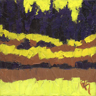
I decided to do some small paintings on paper to experiment with bolder color and abstraction, below are the results.
The first one is a blue flathead powered Model A Ford hot rod roadster with a vibrant orange, yellow, green and blue background and a violet and pink foreground.
The second sketch is a red Model A Ford five window coupe hot rod with an orange and yellow background and a pink and purple foreground.
The third painting is a 1936 Ford chopped coupe hot rod with a red and blue background and a pink and blue foreground.
I really enjoyed these little sketch paintings and plan on exploring this colorful abstract style further.
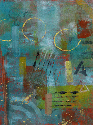
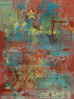
This is the last new sketchbook for a while, I promise. This is the third dedicated purpose sketchbook I started recently, this one dedicated to exploring abstract compositions and techniques.
I started by making two at a time with the same basic color scheme using red oxide, teal and yellow.
"Abstract Sketchbook 1 Sketch 1"
"Abstract Sketch 1 Sketch 2"
I started by applying gesso tinted with red oxide acrylic paint in both cases. I then splattered teal and yellow paint and went over that with a roller. I then applied some collage elements, pattens, text, etc. Then more paint was applied with a narrow roller creating textured rectilinear shapes. More shapes were added using stencils and then some deliberately placed rectangular brush strokes and some stampings. Then the compositions were topped off with some oil pastel strokes and shapes.
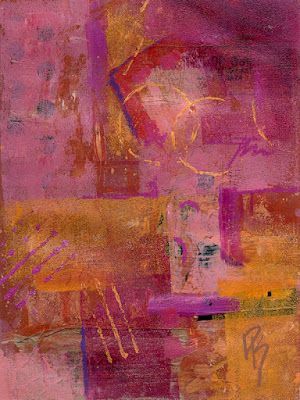
"Abstract Sketchbook 1 Sketch 3"
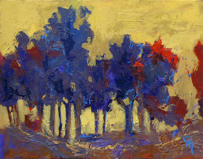
"Abstract Sketchbook 1 Sketch 4"
The second set of two were made with similar process but a different color scheme using red, magenta and orange.
A few weeks ago I dug an old painting on canvas out from under the stairs. I guess I had put it there with a bunch of stuff just to get it out of the way. I was doing some reorganizing and cleaning up in the basement, a project that seems to be permanently ongoing. This painting was an abstract, the first non-objective abstract painting I had ever painted and I only did it as a class assignment as I wasn't really interested in painting abstract at the time, and even now only do that on occasion. However, I had never thrown this painting away. Why not? I've thrown many other paintings away, so why not this one, why have I been keeping it around all these years?
I carried the painting up to my studio and stood it up at the end of the table where it would be out of the way but easily accessible...and then promptly ignored it. That is until this week, I took the old painting out, looked it over and decided it was worth a good work over.
I started by adding texture using heavy gel medium. The painting already had texture but I felt it could use more. After the medium had dried I started adjusting the painting. I mostly kept the same composition and colors, though there is more dark area in it now and I increased the size and brightness of the light area in the lower middle. I also intensified the colors a bit as the painting was somewhat dull but not too much because I wanted to keep it dark and moody overall. Another thing I did was spray water on it while paint was still wet to cause some runs, the painting didn't have this element before and I do think it was an improvement.
I'm glad I picked this old painting up and played with it again, even though abstract isn't really my thing I might do some more in a similar vein.
My experimentations of late have led me to yet another series. I used several different new materials and techniques to create these three paintings. I experimented with using tissue paper to create texture, drip painting using hi-flow acrylics and even oil pastels to finish the painting off. I decided to use trees as the subject even though these techniques are not conducive to realism so even though the idea is trees the result is very abstract.
Since this one was the first in the experimenting I had put down a layer of abstract drips before I applied the tissue paper and I added some marks with paint marker to finish it off.
This one maybe got a little more representational. From my experience on the first one I decided to apply the pieces of tissue paper right after toning the panel, and applied them with the composition in mind. This one is where I got the idea to use oil pastels instead of the paint markers to add some linear elements at the end, I think it looks better, more natural.
I made this one using the same process as the "Towering Pines", again with a general composition in mind but staying open to whatever the paint wanted to do.
Continuing with heavy experimentation lately I did something else totally new to me. I did a series of small acrylic/collage abstracts. I decided to choose a theme, "rust". I printed out some photos I've taken of rusty metal panels and sealed them. I used gel medium to affix pieces of the rust photos to the canvas paper surface. I also added some collaged text from old magazines. I decided to keep the colors simple and consistent between the four pieces with the primary color being red. I also added some interest in the form of some lines and shapes using paint markers as well as added a small amount of drips and splatters. Since these are small and on paper I'm able to offer them for a more affordable price than my regular acrylic paintings.
I got the idea to make a new series of abstract landscape paintings. I happened to have recently picked up a four pack of 4" X 6" gallery wrap (box style) canvas and was wondering what I should do with them. I finally got the idea to do an abstract landscape series based on the concept of representing the colors of the four seasons of the year, Spring, Summer, Autumn and Winter. I searched through my photographs until I found a composition that was simple and would allow me to include a simple background with foliage and grass in the foreground. I made an underpainting using brushes and then went over them with thick paint applied using palette knives to lend abstraction and texture, including covering the sides. The results of this experiment are shown below.
"The Four Seasons - Spring" Acrylic 4" x 6" x 1.4"
"The Four Seasons - Summer" Acrylic 4" x 6" x 1.4"
"The Four Seasons - Autumn" Acrylic 4" x 6" x 1.4"
"The Four Seasons - Autumn" Acrylic 4" x 6" x 1.4"
I've been very lax about blogging, it's been over a month. I won't make any promises but I'll try to do better.
I decided to do a new series of small abstract landscape paintings, similar to the other series I did that was based on a rural landscape. This time I'm using a mountain marsh as my inspiration for three paintings that use the same composition but different color schemes.
Last week I went for a walk around Silver Lake which is in Brighton, Utah at the top of Big Cottonwood Canyon. Silver Lake feeds Big Cottonwood Creek and is a calm lake with marshy wetland areas along about half of it's shore. Of course I took my camera and took plenty of photographs. I cropped a small portion of one photograph to use as my reference for this series of paintings but still deviated from that composition by putting some "sky" in it.
"Green Marsh" Acrylic 6" X 6"
For the first painting "Green Marsh" I used naturalistic colors. I also painted using palette knives with thick painting which adds a lot of interesting texture.
The 3rd and final painting is a blue color scheme...very blue.
All three paintings were painted on 1.3" deep gallery wrap canvas' and I painted the sides, but kept the paint on the bottom thin so the you can have the option of hanging them on a wall or setting them on a shelf or table as shown in the photo below.
I'm sure many artists can relate. Sometimes you get an idea in your head and just can't shake it, and finally it doesn't matter what's currently on the easel, you have to set it aside and get that thing out of your head and in paint.
I experienced a bit of that this week. The poor tractor painting has been on and off my easel for over two weeks, it came off again a couple days ago. I kept having in my head the idea of pushing abstraction even further while staying representational and using knives. It's no grand idea, but it seemed like it might be a new development for me, so I couldn't wait. I took the tractor painting off the easel and took a small painting I did years ago but was in an older impressionist style I don't really do anymore and painted the same thing over it but with knives and thick paint while keeping in mind to make it as abstract as I could but still recognizable.
Dreaming of Autumn
Like I said, this one is small, just 8" X 6". I kept the same name "Dreaming of Autumn". When I painted the original version it was August and it had been an especially hot and dry summer. While I love summer I was feeling a need for a break and so I took a break mentally by painting an early autumn scene featuring a colorful field and aspen trees in the background. The reference photo I used was taken at a rest area on the Monte Cristo road (state highway 30) in Rich County Utah.
I think I like where this is taking me, I'm sure there will be more experiments to come, maybe even a larger version of this painting eventually.
Oh, what about that tractor painting? Here's a work in progress photo. As you can see I'm using brushes, not knives and keeping it more impressionistic than abstract.
It's good to get out of your comfort zone now and then, especially for an artist. Trying something new can help develop new ideas and new skills. With that in mind I decided to paint three small abstract paintings this week even though I'm not really an abstract artist.
Most of my paintings, especially in the last couple years lean towards abstraction but they always have a subject, which means they are not non-objective which is what a full abstract painting is. To make things a little easier on myself I started with a landscape composition in mind, one inspired by a rural scene with a yellow hay field in in the foreground, a green tree line, a blue sky and a red barn. I didn't use reference a photo, I just had the memory of a photo reference in my mind, this is the result.
"A Spot of Red"
As you can see I kept pretty close to realistic landscape colors and even the shapes are generally representational except for the red spot which doesn't resemble anything in particular but does bring to mind a red barn.
For the second painting I kept the same basic compositional idea but used a warm palette for most of the colors.
"A Spot of Purple"
I didn't look at the first painting at all while making this one, I worked solely from what was in my head. As you can see this one came out much more abstract than the first, hardly even a hint of a landscape in this image.
For the third painting I went with a cool color palette and even broke out the cobalt teal.
Same compositional idea but even more abstract I think. This was a fun experiment and it will be interesting to see how the experience influences my future artwork.
I also made a short art vlog video talking about these paintings, please take a watch;
Okay, I never end up going full abstract, but every now and then I just kind of want to go wild and see how far I can take a subject towards abstraction by slathering on the paint with a palette knife.
Not only was I trying to find the limits of representational abstraction here, I was also trying to simplify. The foreground "grasses" point up into the diagonals of the "field" which draws the eye to the distant barns which are backed by trees, mountains and sky. The painting has lots of color interest in it without hitting you over the head with it. I used a photo I took while exploring the rural back roads of Spanish Fork, Utah as my reference. I think I came pretty close to my goals with this painting, it's pretty simple and abstract while having plenty of that palette knife induced texture I love.
My latest painting was a bit of an experimentation on a couple fronts. First, I was doing the same thing I've done with almost every painting lately, and that is pursuing the abstraction of the subject while maintaining representation. In same ways I think this painting was a gentle nudge in that direction but in other ways possibly a bit of a pull back.
The other experimental part to this painting has to do with the title of this blog post. As you can see this painting has the texture of a palette knife painting, except I didn't use just palette knives to paint this autumn landscape. First I toned the panel using quinacridone burnt orange, a misting of water and a paper towel. After outlining the basic composition with a brush I massed in the painting using brushes, but starting with paint mixed with glazing medium so it went on transparently. After a few layers I started using more opaque paint until the painting was more or less blocked in, but at the same time it wasn't my intention to totally cover the surface, I like to see bits of that quinacridone poking through here and there also I didn't want the paint to get too finished before the next step. Next I got out the palette knives, however I didn't put the brushes totally aside yet. I kept one old medium size bristle brush out and used it to modify some of the palette knife strokes, in fact in some cases I applied a small pile of paint with the knife for the express purpose of hitting it with the bristle brush after. I didn't want to go crazy with this effect so I only did it a few times and then finished the painting up completely using knives. Here are a couple close up crops showing the texture, layers and the effects of using different application techniques.
Click on image to enlarge
Click on image to enlarge
I did have a reference photo for this painting, taken somewhere in Ogden Valley, Utah I believe and it was taken during autumn but it was early in the season so had more green than I wanted and I also took some artistic liberties with the composition and shapes. I didn't want to focus on the photo too much anyway, hard to paint abstractly while looking at a photograph. Notice I only hinted at the grass, in the photo the area to the right of the road had lots of tall grass and it's always tempting to put that in for me because I love the texture of grass, so minimizing that, only suggesting it I think helped to keep this landscape abstract.
Using a palette knife instead of a brush for painting presents the opportunity for thicker paint application and a more abstract painting style. I decided to try pushing both of those qualities when painting this small landscape.
Click on image to enlarge
"Open Spaces"
12" X 9", Acrylic on 1/8" panel
As you can see the wide open spaces of the countryside is my inspiration for this painting, it often is. I kept the palette knife loaded heavily and the strokes free and overlapping to help push the abstraction while keeping the subject recognizable. There's a great deal of freedom in painting this way.
Here are a couple of zoomed in details of small areas of the painting. Here you can really see how thick the paint is and how random the strokes appear to be but when you zoom out and see the whole image it becomes something familiar.
By the late 1960's tractors were becoming more angular in design, more modern I guess but a little less visually appealing. However most still didn't have cabs, fenders and fully enclosed engine bays yet so that can still make interesting art subjects.
"Red Abstract Tractor"
11" X 14", Acrylic on panel
The tractor that is the subject of this painting is an example of the direction the designs were going by the mid 60's, though it might be hard to tell since I painted it semi-abstract using a palette knife. The tractor in my reference photo was actually missing the hood, but I'm fairly confident it was a Farmall by International Harvester.
For some people all tractors are green, as in John Deere green. Early John Deere tractors are often referred to as "Johnny's", or "Poppin' Johnny's" if they are running the two cylinder engine that kind of "pops" as the tractor lopes long.
"Abstract Johnny"
20" X 16", Acrylic on panel
Lately abstraction has been on my mind. Not that I want to paint abstracts, but rather I want to paint representational images that are nearly abstract but still readily recognizable. I figure the best way to achieve that is to paint using palette knives, or even better, "wedges". What's a wedge? It's what Princeton calls it's line of paint application tools that are basically a thin contoured wedge shape, some come with shaped edges for creating special textures. On this painting I used the wedge they call "Contour C-83" for almost the whole painting. I kept the background totally abstract and just applied blocks of various colors which is kind of what I did for the body of the tractor as well.
When using alternative tools to paint with you often give up a degree of control, which is fine, it keeps you from getting too fussy. I really like the effect and enjoy painting this way, as a bonus I don't have to rinse out and clean any brushes.